Mobile Application

NortonHealthcare

Revolutionizing Healthcare Access: Enhancing Norton Healthcare’s Mobile App with DesignersProHub Advanced Technology.

Google Play App Store
Side Image 1
ClientBrief

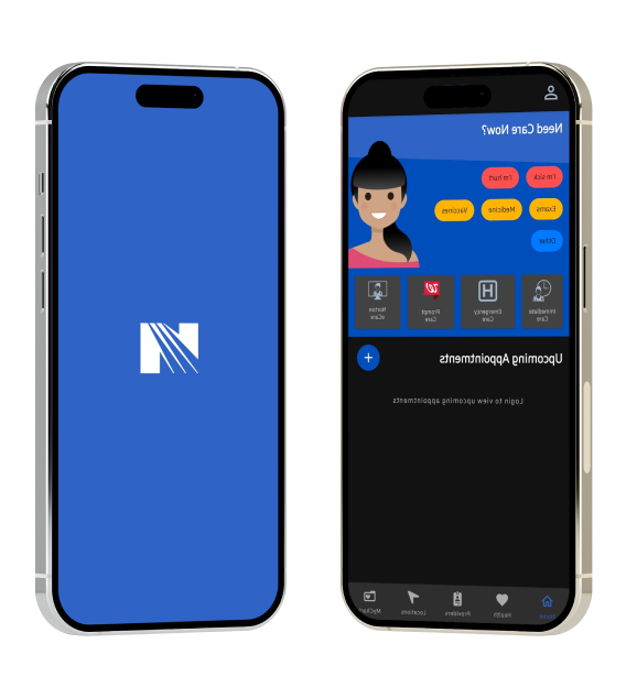
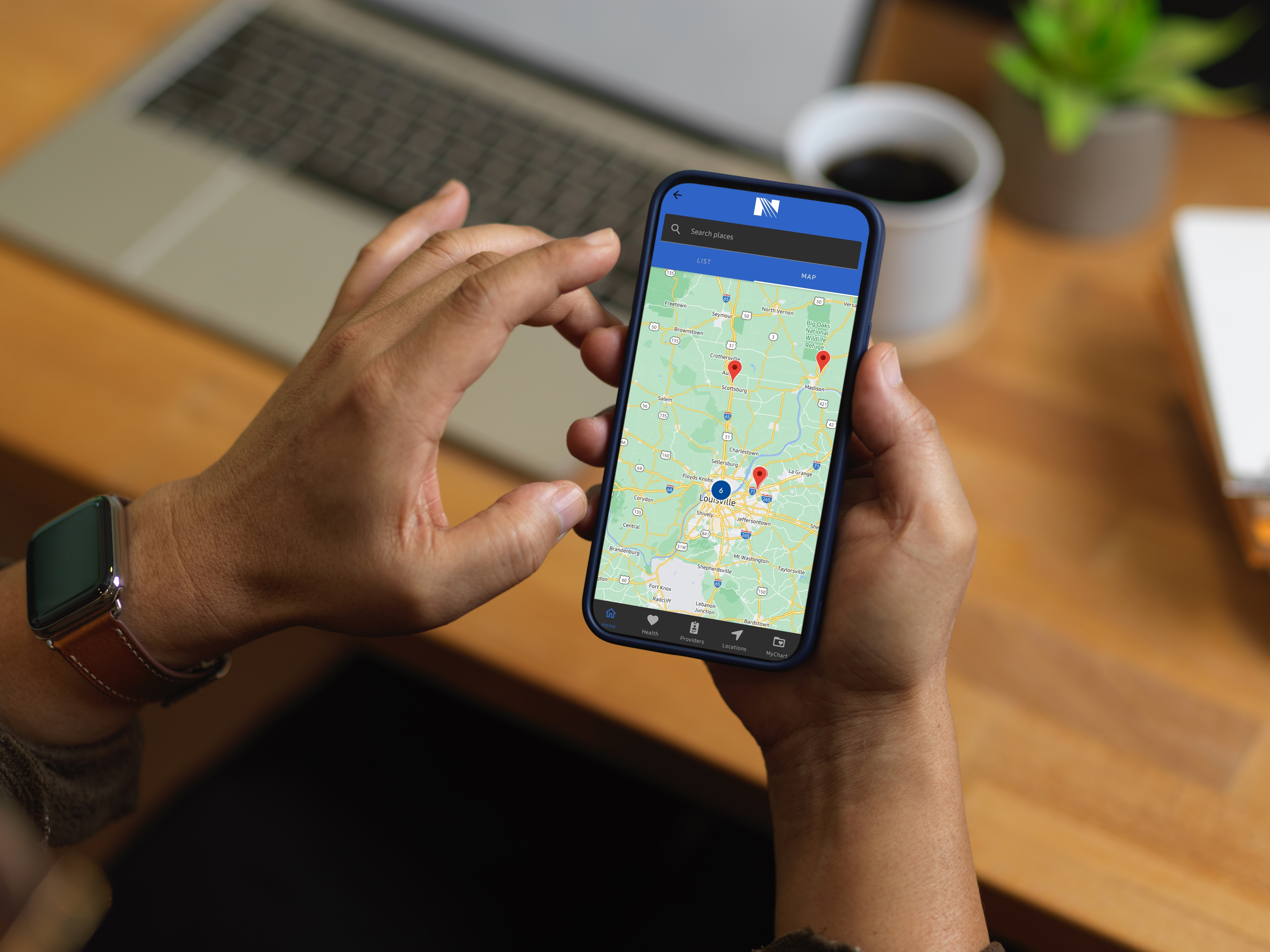
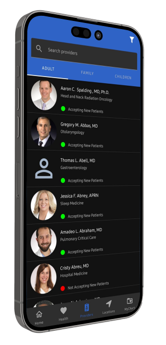
Norton Healthcare aimed to create a comprehensive mobile application that provides users with instant access to the largest network of physicians, hospitals, urgent care centers, and specialty centers. The app is needed to facilitate easy appointment scheduling, healthcare management, and access to medical records.

Awards Banner

Mission

DesignersProHub mission was to develop a user-friendly, feature-rich mobile application that enhances user engagement and provides comprehensive sports coverage. This involved redesigning the existing platform, integrating new features, and ensuring a seamless user experience.

Side Image 1
TheProblem
  • An outdated app design that limited user engagement and functionality.
  • Inefficient appointment scheduling and healthcare management processes.
  • A need for enhanced features to provide comprehensive healthcare access.
  • Limited analytics tools to provide actionable insights into app usage and patient engagement.
  • The Solution

    DesignersProHub provided comprehensive solutions to address these challenges and elevate Norton Healthcare’s mobile application

      Modern, Responsive Design:

    • We redesigned the app with a sleek, modern look that enhances user experience and engagement. The new design ensures optimal performance across all devices.
    • Advanced Sports Coverage:

    • We integrated advanced features for real-time updates, scores, stats, and highlights, providing users with comprehensive sports coverage.
    • Advanced Healthcare Management

    • We integrated advanced features for appointment scheduling, healthcare management, and access to medical records.
    • User-Friendly Interface

    • The revamped interface simplifies healthcare access, making it easier for users to find care locations, schedule appointments, and manage their health.
    • Comprehensive Analytics Tools

    • Detailed analytics tools were integrated to provide insights into app usage and patient engagement, helping Norton Healthcare optimize its services.
    Side Image 1
    Typography

    The Norton Healthcare website employs a carefully selected typography system to ensure readability, aesthetic appeal, and consistency across the platform. The use of modern sans-serif fonts like Helvetica and Roboto Slab provides a clean and professional look, enhancing the user experience.

    1. Helvetica

    Family

    Roboto, Helvetica, Arial, sans-serif

    Style

    Normal

    Weight

    600

    Color

    • Primary Text: rgb(123, 128, 154)
    • Emphasized Text: rgb(58, 65, 111)

    Sizes

    • Primary Text: 16px (26px line height)
    • Emphasized Text: 12px (20px line height)

    Usage

    Helvetica is the primary font used throughout the Norton Healthcare website. Its different weights and colors are utilized to create a clear visual hierarchy, making the content easy to read and navigate.
    2. Roboto Slab

    Family

    Roboto Slab, sans-serif

    Style

    Normal

    Weight

    600

    Color

    rgb(123, 128, 154)

    Size

    24px (33px line height)

    Usage

    Roboto Slab is used for specific headings and subheadings, providing a distinctive and modern look. Its bold weight ensures that important sections stand out, guiding users through the website.
    3. System UI

    Family

    system-ui, sans-serif, "Apple Color Emoji", "Segoe UI Emoji", "Segoe UI Symbol", "Noto Color Emoji"

    Style

    Normal

    Weight

    400

    Color

    rgba(0, 0, 0, 0) (black)

    Size

    16px

    Line Height

    24px

    Usage

    This font is utilized for body text, providing a comfortable reading experience with its standard weight and size. The system-ui font ensures compatibility across different devices and platforms, maintaining consistency in the website's appearance.
    Color Scheme